Saturated pans with soft blooms
Pigment opens quickly, layers cleanly, and leaves edges with warmth instead of harshness.
Pintura Viva / Studio Palette
12-pan watercolor palette for character sketching and story-rich illustration.
The palette
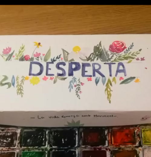
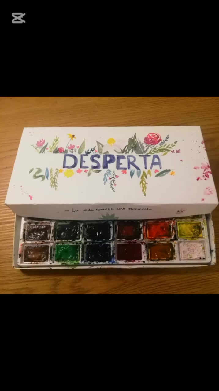
DESPERTA keeps the format compact and the feeling generous: bright pigment, soft blooms, and a warm studio presence.
Pigment opens quickly, layers cleanly, and leaves edges with warmth instead of harshness.
DESPERTA feels at home beside sketchbooks and pencils without taking over the workspace.
The painted floral artwork turns DESPERTA into an object worth keeping close.
The ritual
One clear rhythm: wake the color, build the shape, set the gaze.
Touch water to pigment until the pans bloom with a soft, ready surface.
Let loose washes and confident edges define the silhouette without locking it too soon.
Eyes, tilt, posture, and small details give the drawing its pulse.
Made for
DESPERTA suits artists who move between loose ideas and finished atmosphere.
Characters
Capture mood, stance, and attitude fast enough to stay inside the idea.
Creatures
Explore fur, feathers, tails, horns, and invented forms through layered watercolor.
Stories
Build scenes with atmosphere, movement, and just enough narrative tension.
The film
Watch DESPERTA move from palette to paper, then into a finished expressive character study.
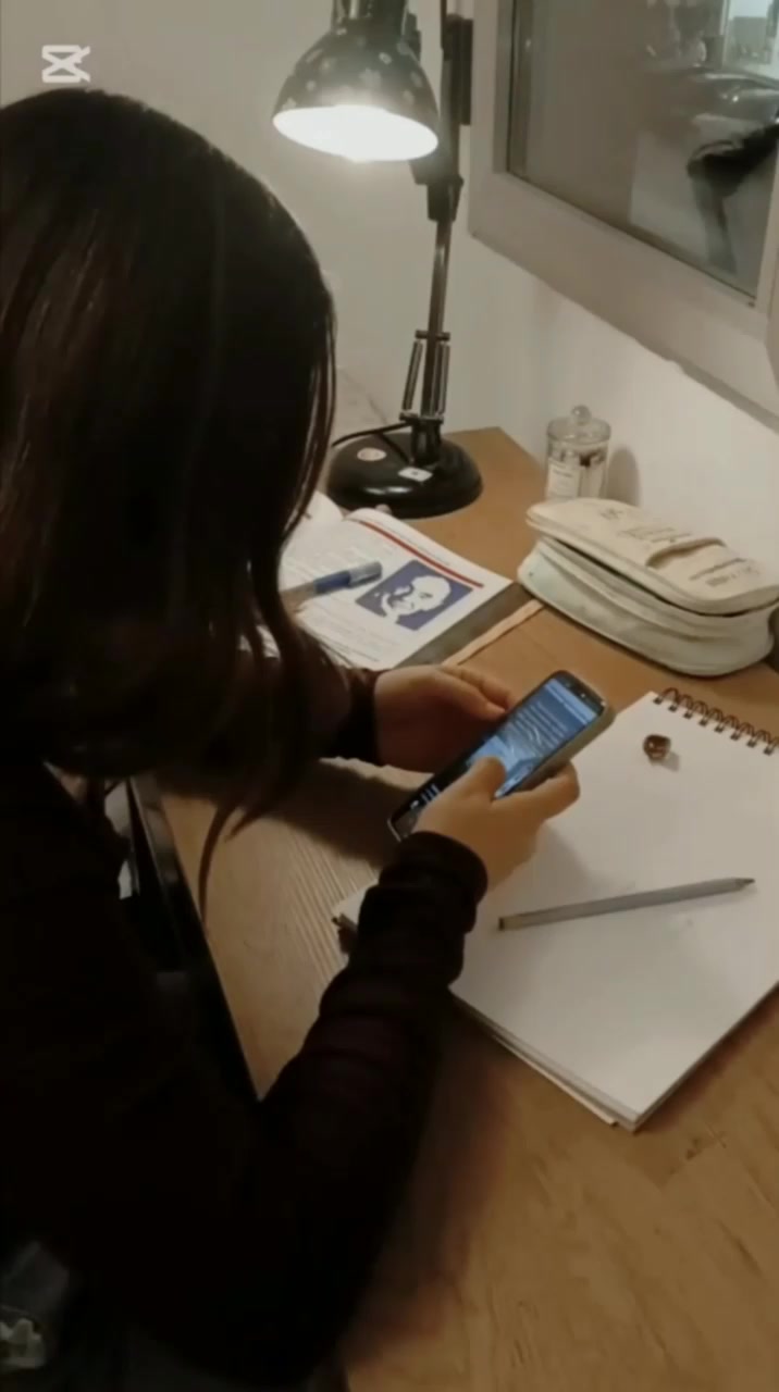
A quiet workspace sets the tone: intimate, handmade, and ready for color.
The floral sleeve and pigments introduce DESPERTA as a finished art object.
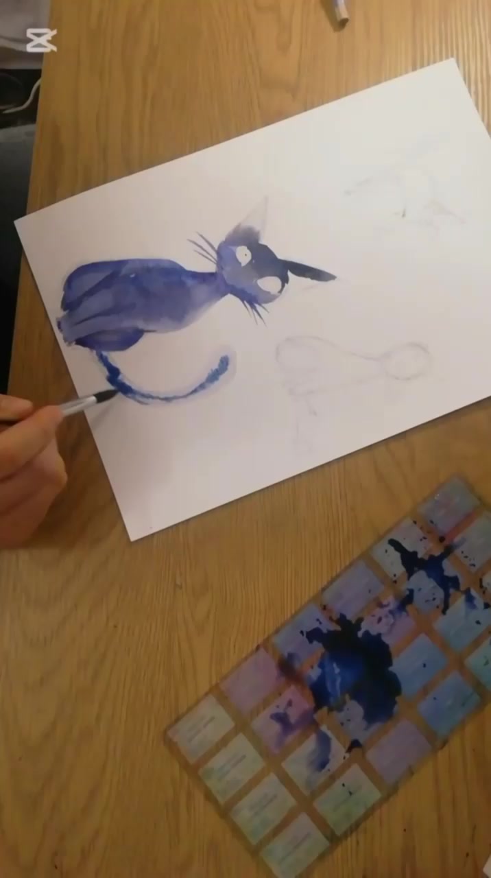
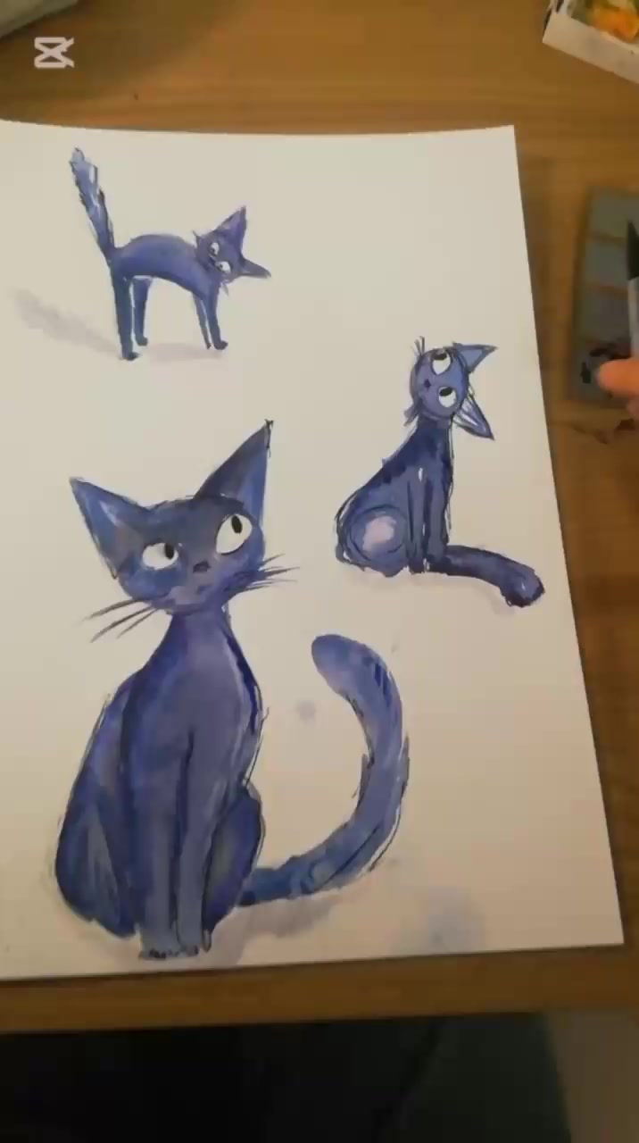
Layer by layer, the watercolor cat gathers attitude, gesture, and expression.
The final reveal lands cleanly, ready to pass from desk to wish list.
Gallery
Short glimpses of paper, pigment, character, and sleeve.
Product details
Essentials of the DESPERTA palette.
Studio note
DESPERTA belongs beside sketchbooks, pencils, and pages that want a little more life.
FAQ
Clear answers before you reserve.
DESPERTA is a 12-pan watercolor palette from Pintura Viva, created for character sketching and story-rich illustration.
It is made for artists, students, and illustrators who want warm watercolor character work with personality and movement.
DESPERTA includes the 12-pan palette and the painted botanical sleeve shown throughout the film and gallery.
Use any Buy DESPERTA button to open the reserve sheet, leave your email, and receive first-drop access updates.
Subscribers on the first-drop list receive the release date and product updates by email.
First drop
Join the first-drop list and be first to hear when DESPERTA opens.
pinturaviva.varik.es